High-quality cookware inspired by a higher calling.
High-quality cookware inspired by a higher calling.
Services
Brand Identity
Packaging Design
Print Design
Illustration | Icons
Photography
Art Direction
Artworking
Credit
Photos: Upfront Photography
Collaboration: Studio Artl
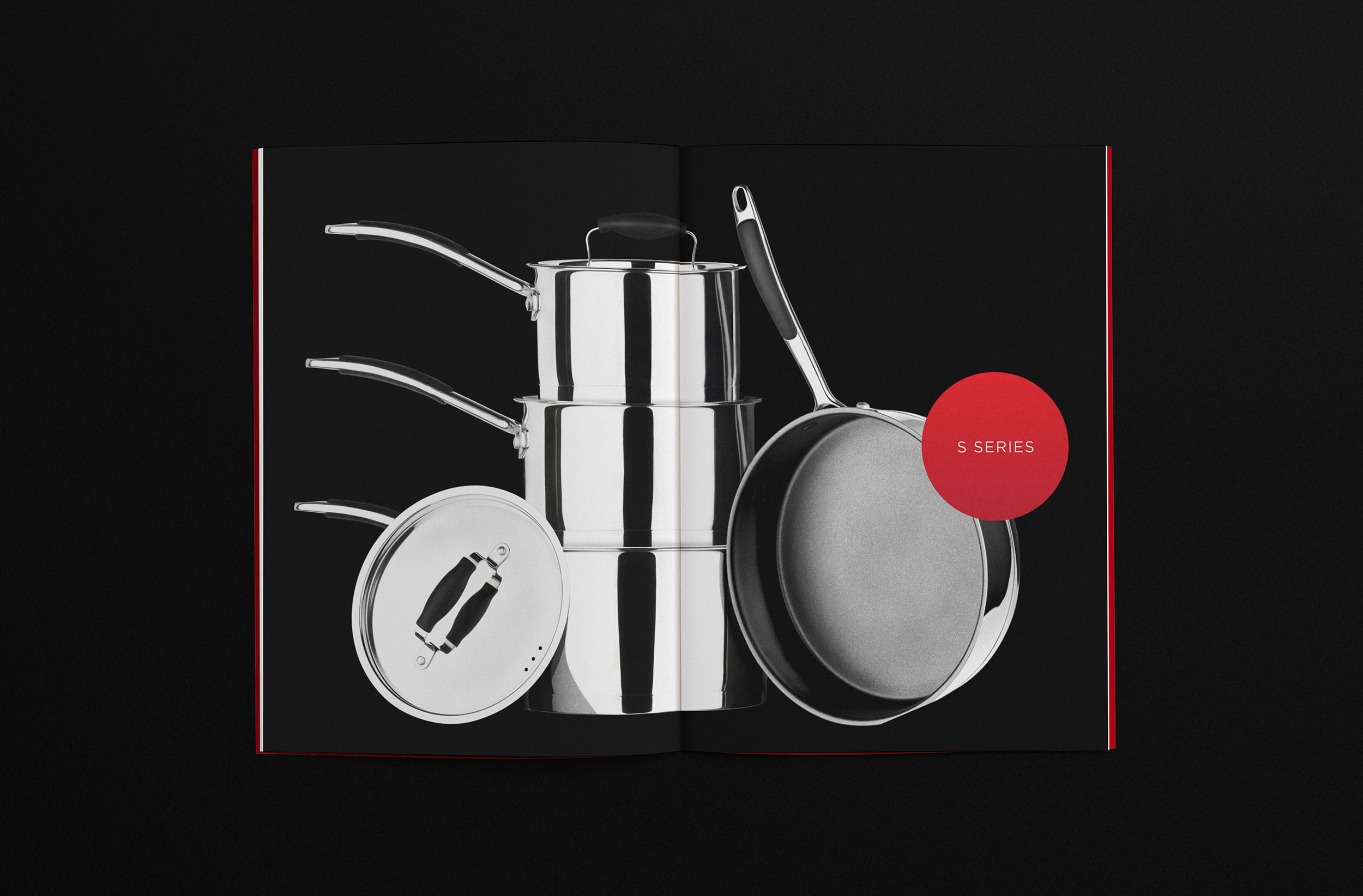
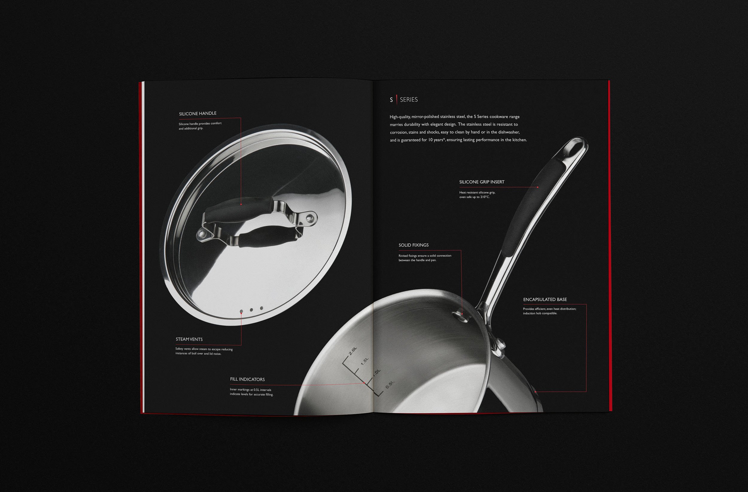
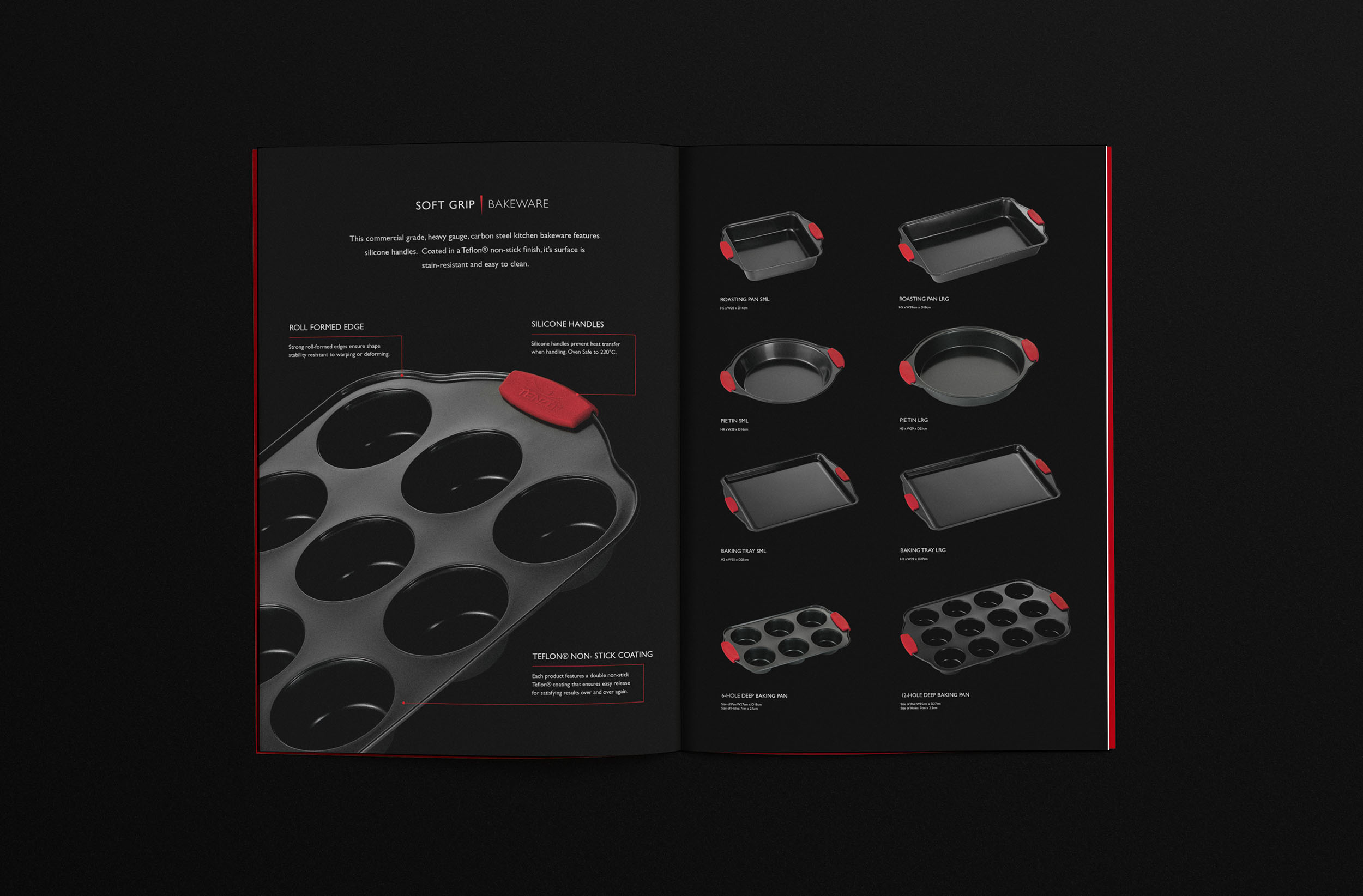
Tenzo is a range of high-quality, precision-made cookware. Consumers benefit from materials and technologies usually only found in high-grade commercial use kitchen products. Guaranteed to be long-lasting and designed to elevate the home cooking experience and take it to a higher level.
The brief called for the naming and creation of a brand identity and packaging design system that would position the cookware alongside existing upmarket cookware specialists. Designed to inspire passionate home cooks looking to up their game by entering into the world of pro-line cookware products and empower them to level up on their cooking abilities at home.
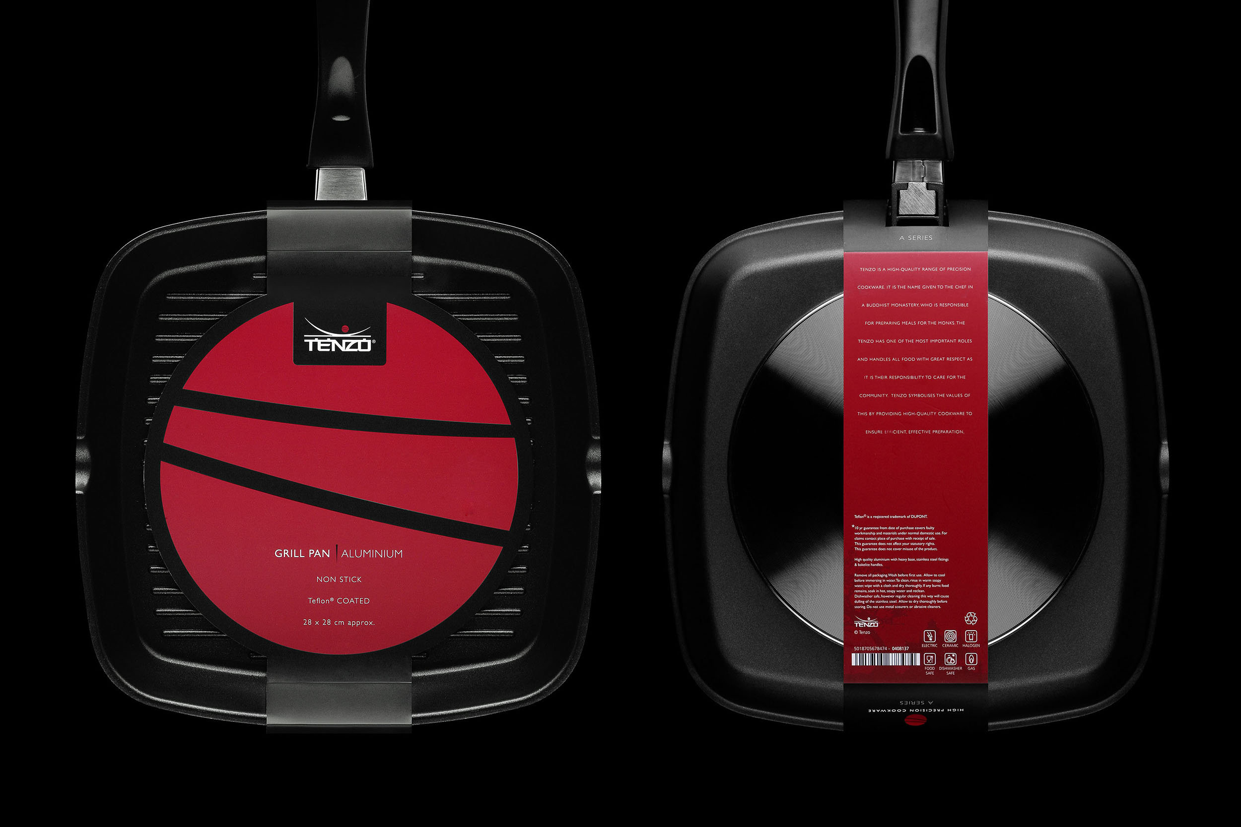
The name derives from the Japanese title given to the chef at a Buddhist monastery. An important role, the Tenzo is responsible for preparing the food offerings for the monks, handling the food with great care and respect. Tenzo cookware aims to embody similar values of efficient preparation, cooking, and serving of meals. Japan is synonymous with precision, from social etiquette and punctuality to the relentless pursuit of craftsmanship and devotion, it seemed fitting to align this association with the product range.
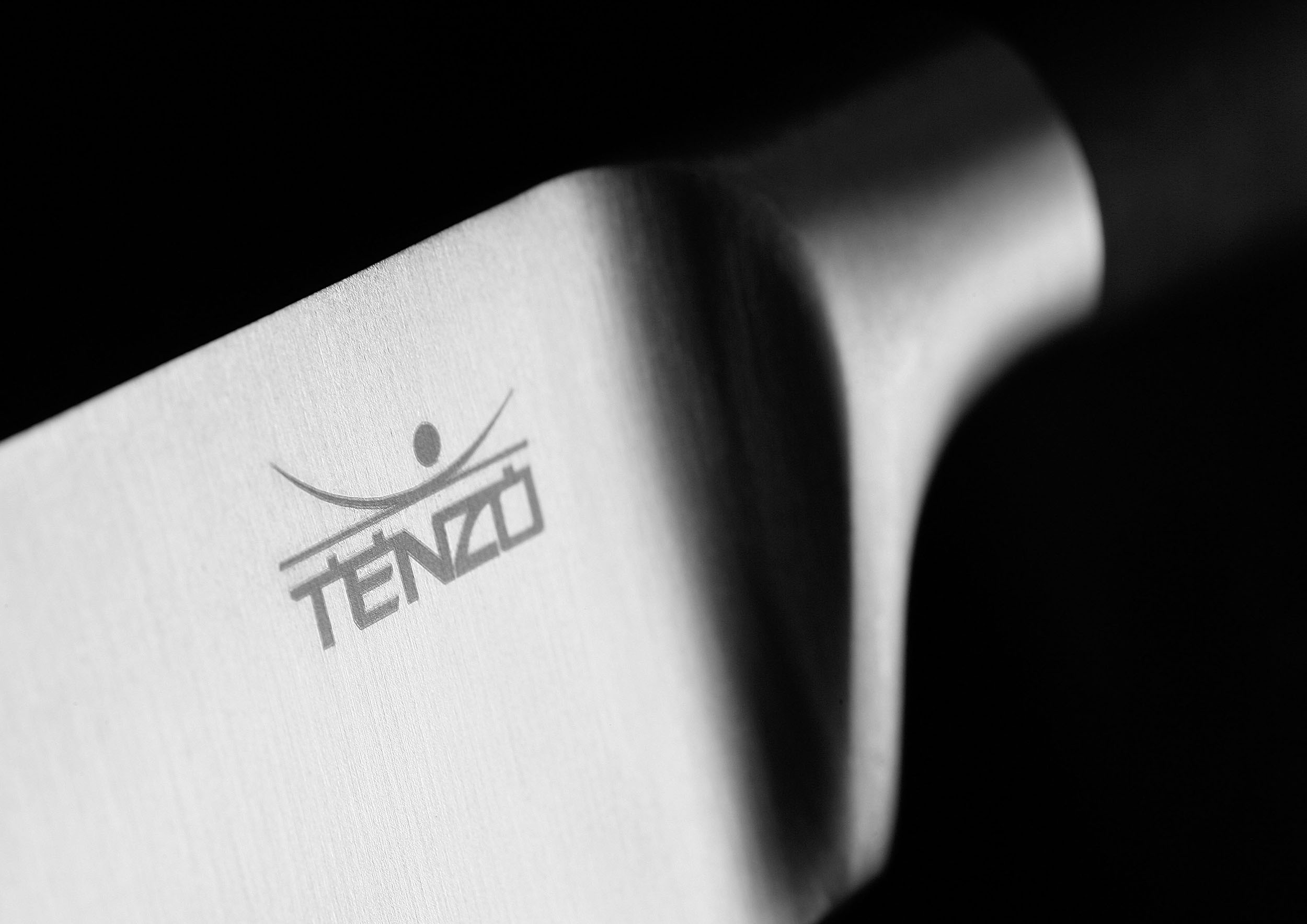
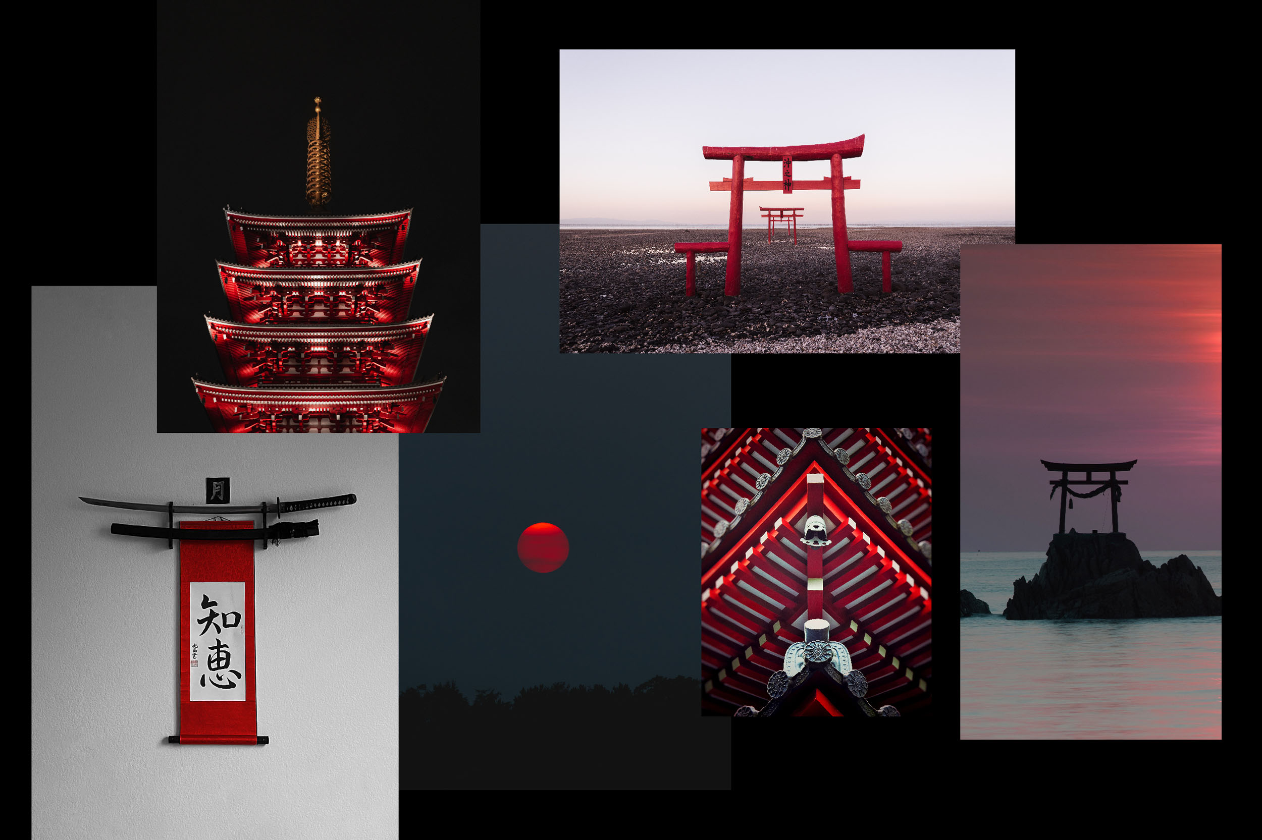
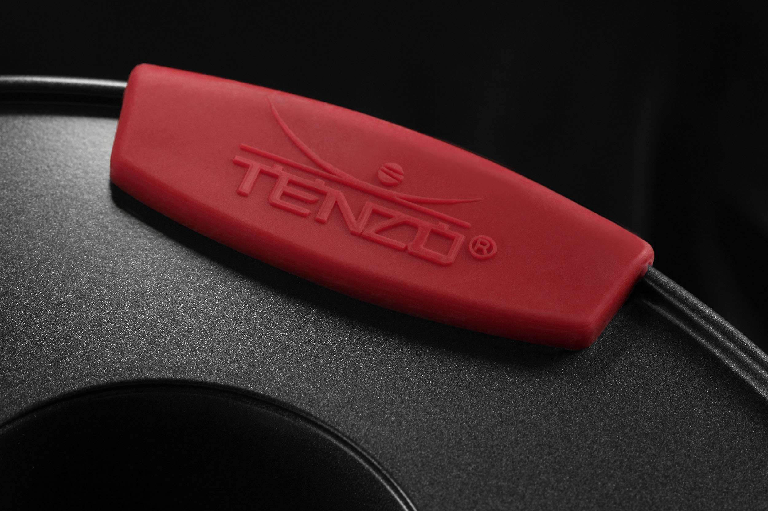
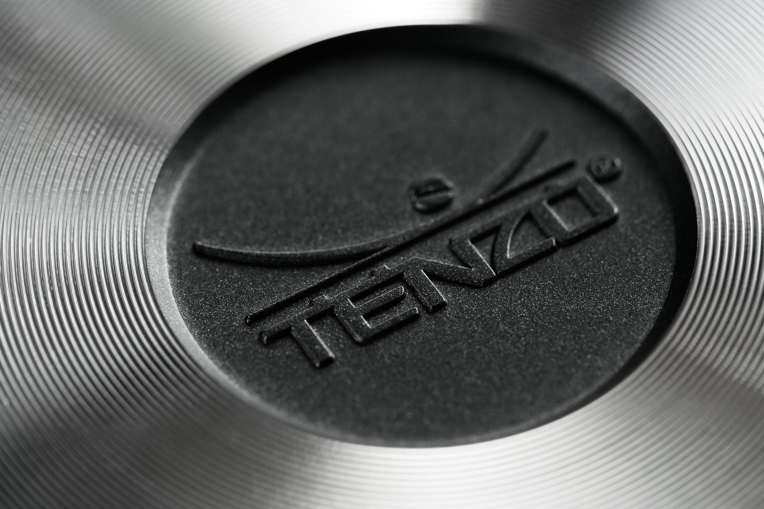
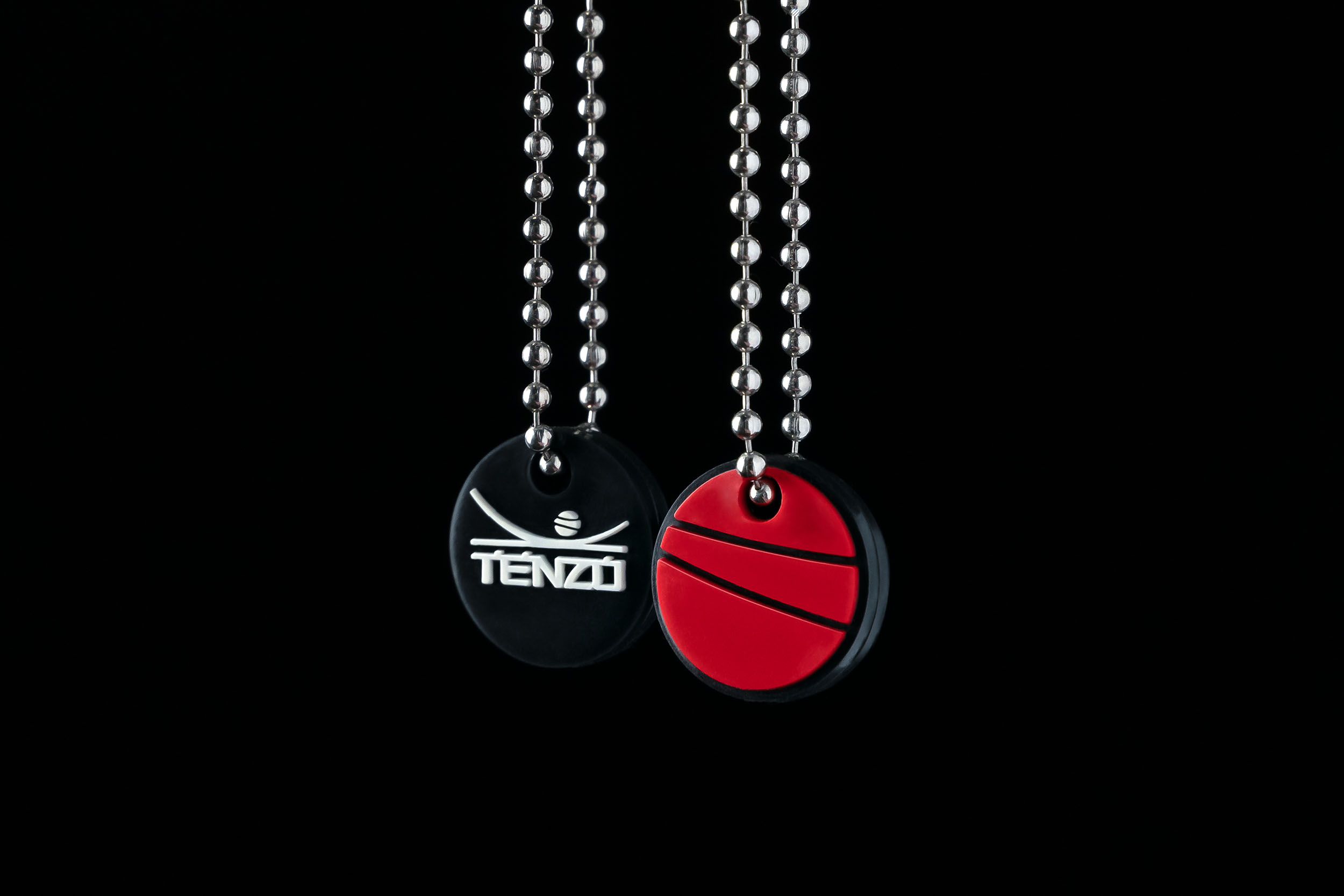
The logo and brand assets take inspiration from a hybrid of visual elements associated with both Buddhism and Japanese culture. Shrine and monastery architecture, the Kana writing system, and the Sun, each influence the final logo mark created for the brand.
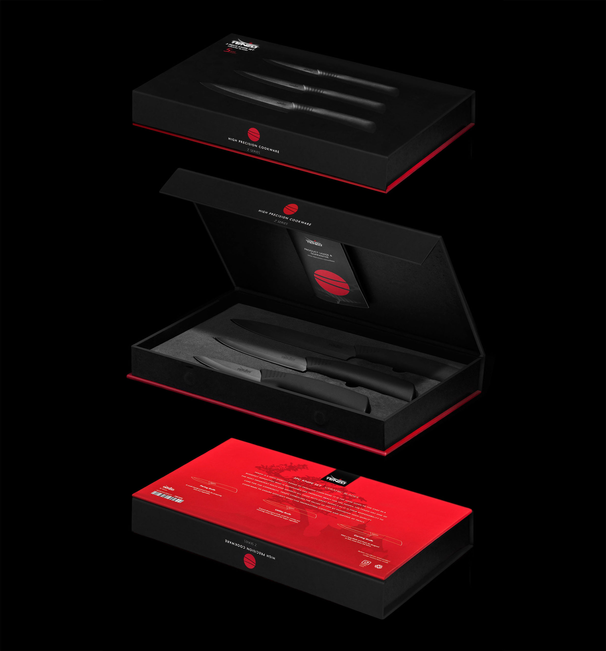
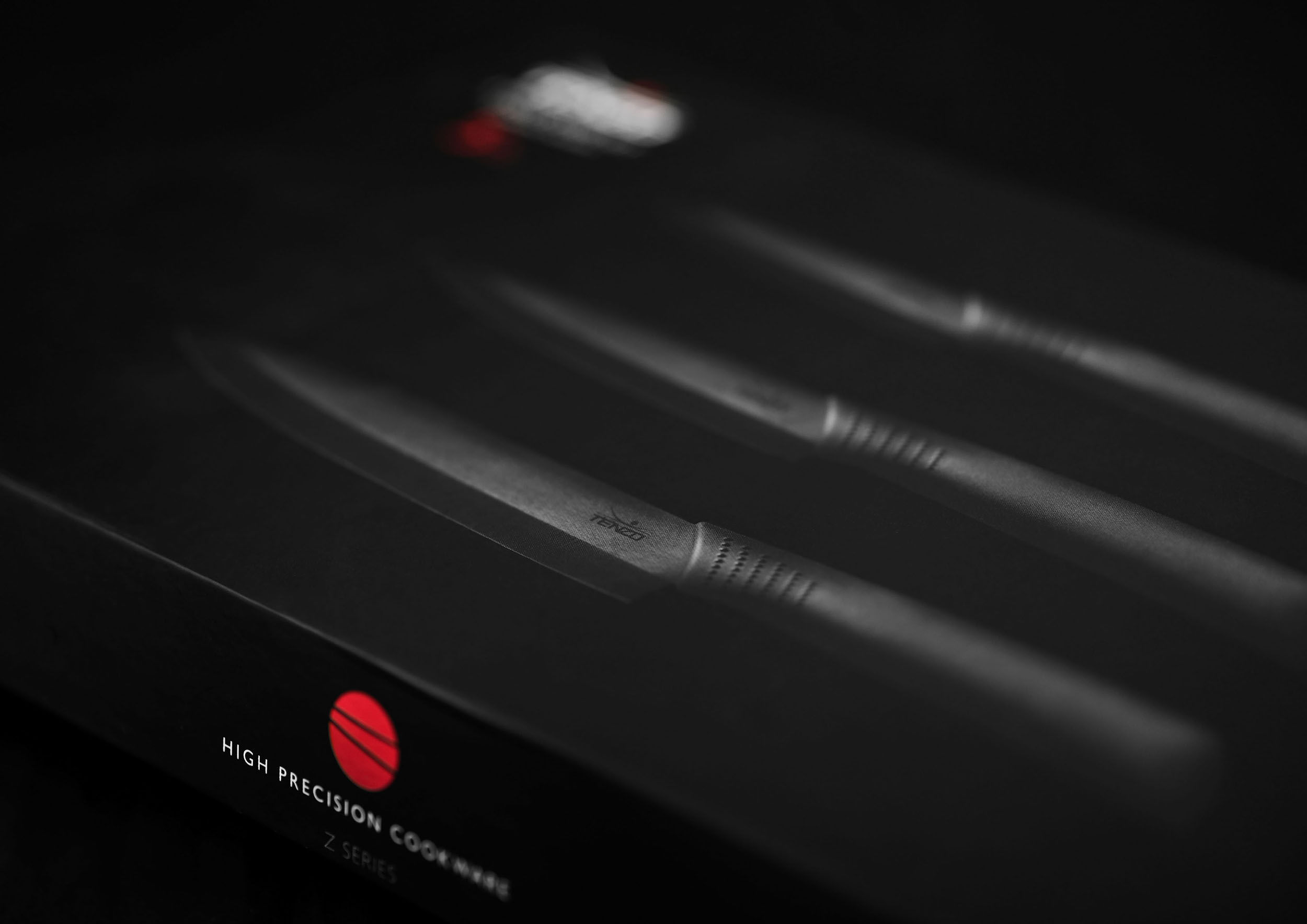
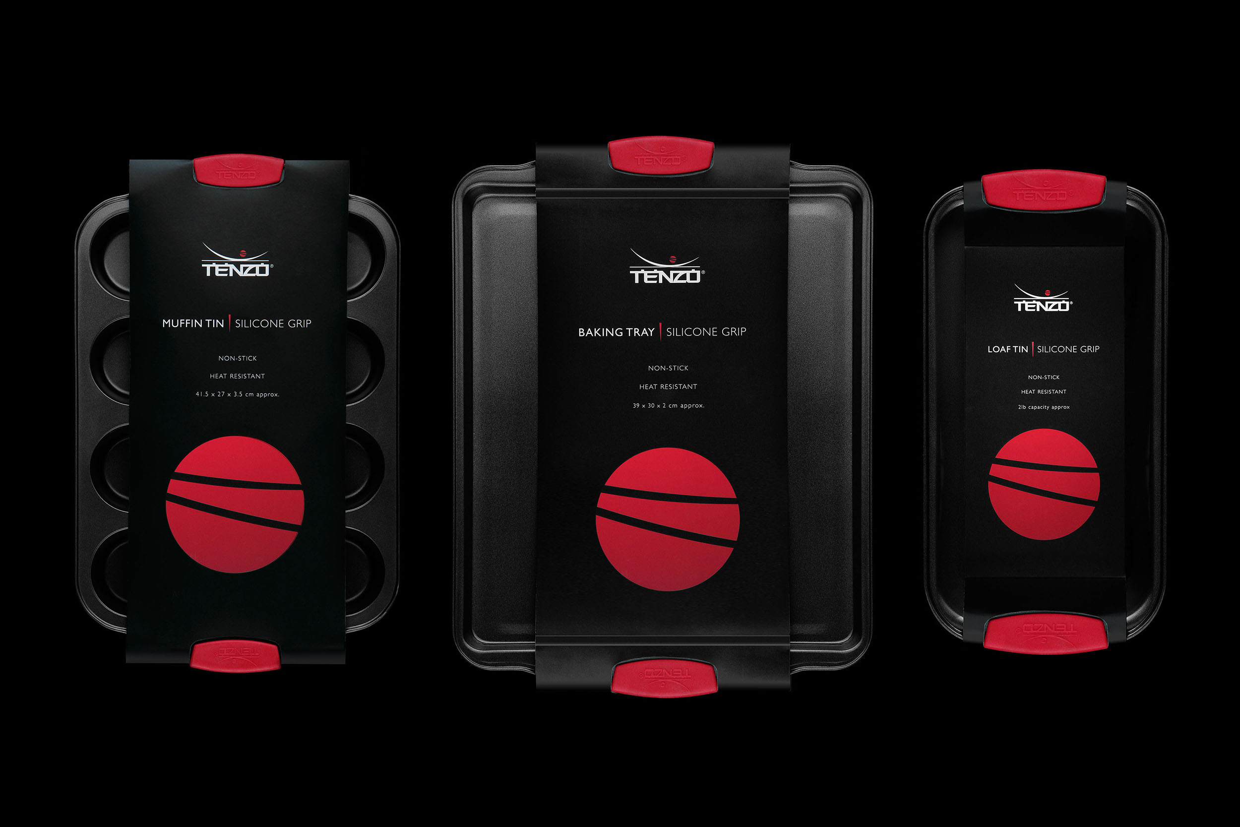
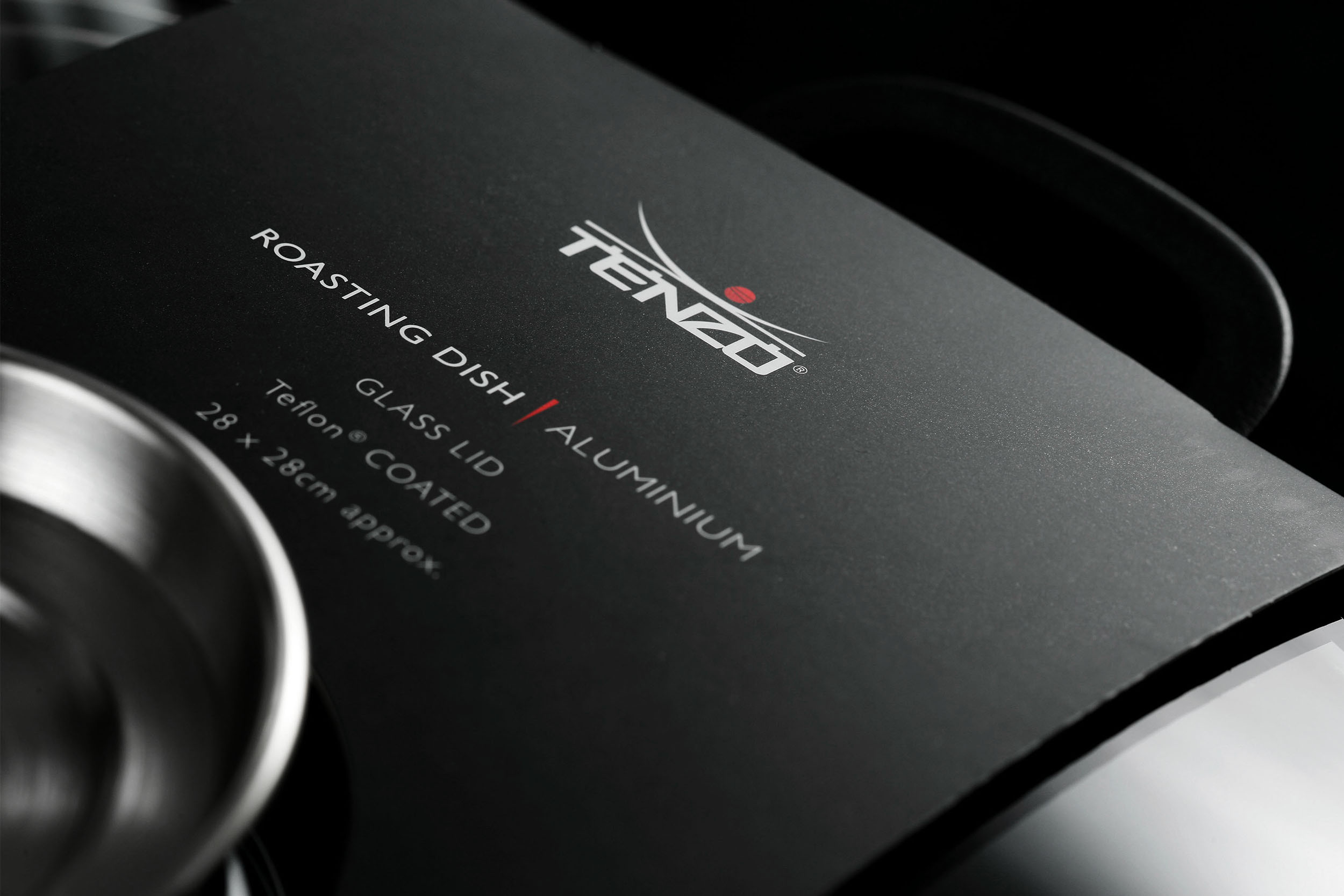
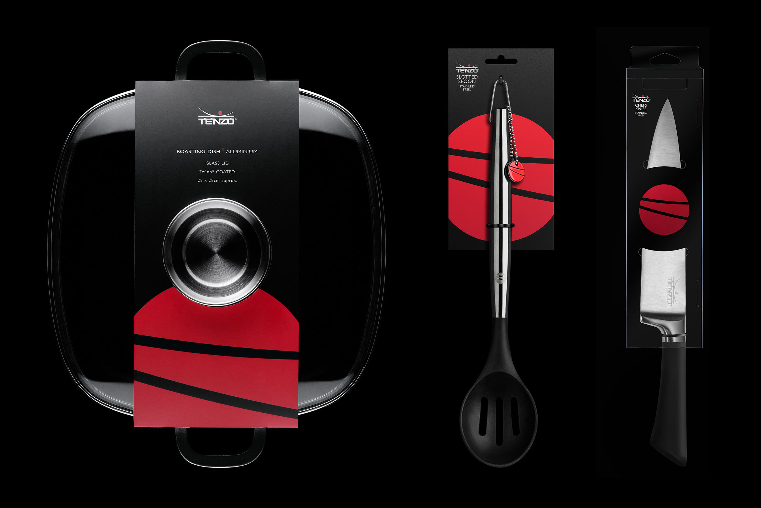
The result is a clean, vertical design system that can be adapted to work across varying-sized packaging types, from wraps to boxes, and hanging cards. Predominantly matte black in design with an accent of red it aims to be eyecatching from afar with the use of white space and minimalist typography helping it remain understated with a premium feel.


Tenzo is the Japanese title given to the chef at a Buddhist monastery. Tenzo cookware embodies similar values of efficient preparation, cooking and serving of meals.
Tenzo is the Japanese title given to the chef at a Buddhist monastery. Tenzo cookware embodies similar values of efficient preparation, cooking and serving of meals.
